
KURE FM Website Redesign
Reinventing a campus radio station’s website.
Skills
Information Architecture
User Research
Web Design
Usability Studies
Brand Design
Timeline
November 2022 - April 2023
Tools
Figma
Webflow
Introduction
KURE is Iowa State University’s student-led radio station, broadcasting alternative radio to Ames and Story County. KURE provides many services to the university and Ames beyond music, such as:
Supporting local businesses through underwriting and on-air readers to help advertise.
Offer services like equipment rental and studio space to record podcasts and talk shows.
Allow college students to experience the maintenance and responsibility of running a radio station.
In addition to services, KURE also holds many events throughout the school year, including, but not limited to…
KUREFest - A concert supported by KURE featuring both well-known and local artists.
KaleidoQuiz and QuickyKwiz - Trivia events broadcast with prizes, scores, and more on radio waves.
Terrace Tuesdays - A small form concert that showcases local artists.

Why is a redesign necessary?
#1
Many services that KURE offers aren’t visible with the current architecture of the website.
#2
The current website’s design lacks brand identity in comparison with other stations.
#3
Many components of the website like the web radio don’t function properly. This redesign opportunity can also be a maintenance patch.
#4
Some pages are outdated, such as the current board of the directors. A content update is necessary.
Goals
Understand KURE’s demographic and responsibilities, and how that lines up with a website.
Evaluate the current website’s strengths and weaknesses, and find areas of improvement.
Generate low-fidelity and high-fidelity prototypes to use for user testing and provide direction towards the development of a real website.
Write a case study going over findings and design choices to guide further iteration.
Empathize
User Personas
KURE offers a wide variety of services, and people participate in KURE’s activities for different reasons. I created personas to reflect a diverse userbase, and developed user journeys for each of them to identify the current pain points of the website. This guided my work on the interactional elements.


Ideate
Sitemap
A priority of my work was restructuring the information architecture of the website. The structure as it stood seemed disconnected and not built to the scale that KURE had evolved for over the years. Using my user persona research, I prioritized the utmost important features to be accessible at all times through a navigation bar, and the rest would be organized compartmentally. In doing so, I hoped that the interaction of navigating the website would be much simpler and intuitive.
Paper Wireframes
Paper wireframes were made to generate rapid-fire ideas of possible layouts of the website. Crazy Eights allows for many ideas to be drawn out at once, and allowed me to pick out elements from each sketch I thought was best for the website.

Design
Digital Wireframes / Low-Fidelity Prototype
All UX design work for this project was done in Figma. The wireframes were built on the layout sketched for the paper wireframes, and an early idea of the information organization that was established. The low-fidelity prototype was used in a round of light user testing to get feedback on major ideas, rather than design aspects.


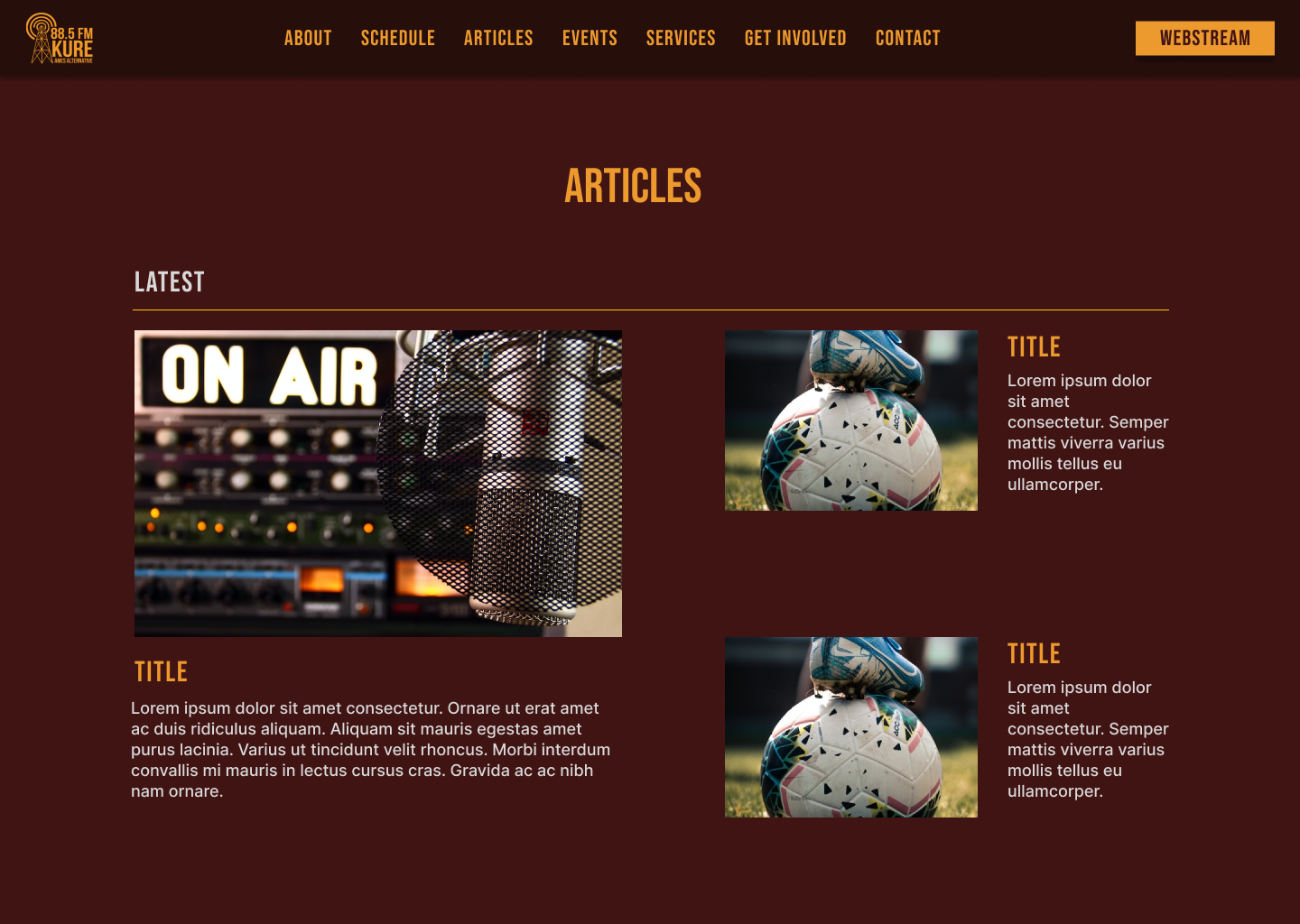
Mockups / High-Fidelity Prototype
After a round of light user testing, which showed some improvements to naming conventions and layout choices, I immediately worked towards the mockups, which allowed me to flesh out colors, and typography.
The colors chosen were associated with KURE’s brand identity, Maroon (#411414) and Gold (EC992D).
The typeface chosen was Bebas Neue, another KURE’s design guide staple. A bold typeface that I wanted to be recognized as you go through your respective user flow.


Testing / Refining
Usability Study

A more formal round of User Testing was done for the High-Fidelity prototype, asking for feedback on the visual aspects of the prototype design, as well as information organization.
A full breakdown of those findings can be found in my research presentation, linked here.
Conclusion + What I’ve Learned
The KURE website redesign was the final project done as coursework for the Google UX Professional Certificate. It was a fantastic experience putting the knowledge I had accrued over the course and put it toward a community I’m apart of and love.
Originally, I intended to directly implement my work here into the website using Webflow. However, after developing the prototype in the web builder, I learned that because Iowa State uses WordPress, I wouldn’t be able to use the website made in Webflow to replace the old one. Still, if time allows me to, I want to learn how to use WordPress and go through the process once again of implementing my design into real work for my community to use.
I intend to return to this case study later once I can dedicate more time and resources toward its full implementation. As it stands now, however, I am grateful to see my skills being applied to the world around me. At the very least, I’ve left a future designer a fantastic starting point.
A case study in Google Slides can be found here.