
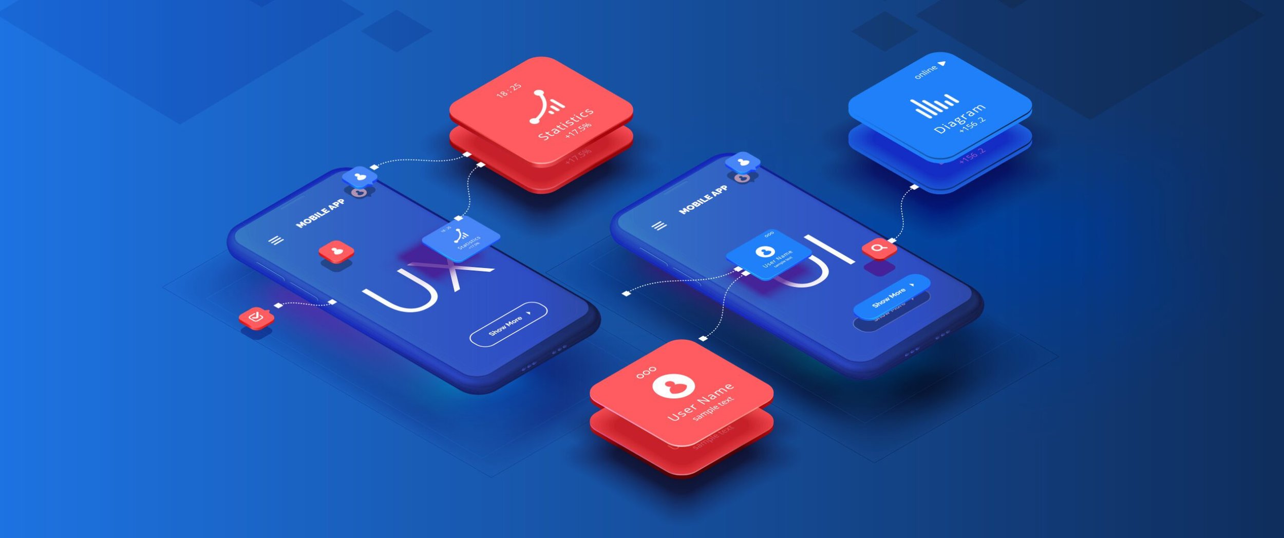
Designing For Good: A Second Trip around Casey’s
Conducting research for an app renovation, enabling a design system in Figma, and making some fantastic pizza.
Skills
User Research
Prototyping
Interaction Design
Project Management
Usability Studies
Design Systems
Timeline
May 2025 - August 2025
Tools
Figma
FigJam
Userlytics
Mural
Role
UX Designer
UX Researcher
Project Manager
Introduction
The opportunity to return to Casey’s for a second summer with the UX team was nothing short of fantastic. I had come in with the expectation that I wouldn’t learn as much as I did as last time, but I couldn’t have been more wrong.
This time around, rather than my focus being on a single project, I had a hand in a lot of projects, listed as such:
DMX - Digital Modernization Project
Intern Group Project
Order Fulfillment App Conversion to Figma
ServiceNow Internal Study
With so many projects, each with their own lessons, I didn’t want to exclude one for the other. Instead, I’ll be framing each experience through the User-Centered Design Process.
Understand - Specify - Design - Evaluate
Whether intentional or not, each contribution I had fit into this process that makes a product so receptive to real feedback. By doing this, I hope that while my experience was diverse and educational, it all was built around the scope of making a process or idea better.

Understand
Project: DMX

When I arrived, the IT Architecture has in the middle of a massive renovation to the Casey’s website and app, changing the software behind both, but also updating the look, interactions, and structure as a whole. A super fun project to dive into!
A responsibility I had was constructing a research study to answer a questions that had come from product owners and creative. Specifically:
What are guest’s preferences when reordering items from a previous order?
How is the discoverability of our “Unlock Offer Code” and how do users perceive it?
Using Userlytics, I crafted an unmoderated study where users completed tasks with app prototypes and gave feedback. I learned a lot about creating studies, like choosing the right measurements and how prototype complexity affects results. The feedback we received taught us a lot about our designs, led to assumptions being questioned, and will likely improve the experience overall.
Ideating
Having a better understanding of the goals of our design solutions, we began putting our ideas onto paper. We started by laying out the architecture of the app using storyboards and use scenarios using a technique called Hierarchal Task Analysis, or HTA, giving us a better conceptual framework of what screens needed to be made, and what user journeys needed to be supported for a Minimum Viable Product, which we would then take to evaluations later. We also conducted a competitive analysis to understand the trends of the design space and what elements we could borrow. The design space for transit smartwatch applications is narrow, but still provides great foundational insights.


Design (Part I)
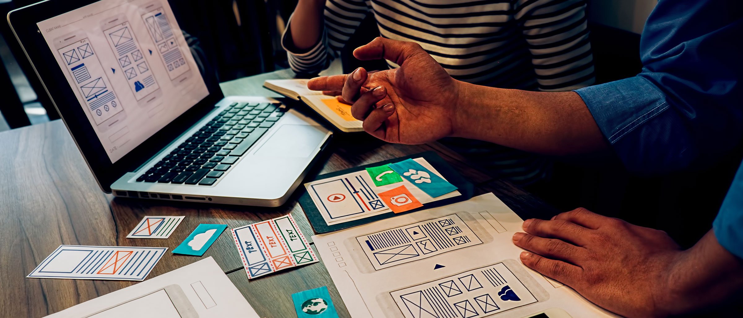
Paper Prototypes
After the foundational work was done, we started sketching our designs, using the Crazy Eights (technically Fours here) method to quickly brainstorm solutions and evaluate those with the most potential afterward. The unique constraint of screen size forced us as designers to keep laser-focus on our users, asking questions like:
What are the goals of the user, and how might we guide them with minimal space?
What interaction design elements aren’t here that do exist on smartphones? How might that change the UX?
What compromises must be made given the design constraint?
For the purposes of an evaluation done later, we sketched out the three user journeys we believed would be most relevant to the user’s goals: checking stop information, favoriting a stop, and setting a stop notification. While these tasks aren’t far from each other mechanically, we wanted to make sure the user flow surrounding these tasks we interconnected, so a user could easily switch between them without going back to the start.

Testing
Expert Analysis
For the first round of evaluations, we employed expert analysis, where rather than bringing in users, we had “experts” evaluate our interface to provide feedback on our designs. There were two options for expert analysis, either heuristic evaluation, where our design was put against UX design heuristics, or cognitive walkthrough, where fundamental questions are asked about the interface from different perspectives. While this isn’t quite user testing, it’s an opportunity to fall back on well-established design fundamentals that is cheaper and quicker than bringing in real users. Our team elected to do both to get both a better understanding of our user flow and interaction design elements. We learned a lot about our design, and identified our most important areas for improvement, that being:
Lack of Simplicity
Lack of Feedback
Lack of Consistency

Refinement
Once our refinement goals were defined, we iterated on our designs. In addition to improving our solution, we converted our paper wireframes to digital using Figma. Given the time constraint of the class, we didn’t have much time after this point to convert our prototype and decided now was the best time to do it.
First, we refined the navigation to be housed in one singular area; Before bus selection was located in the map UI, but after the feedback we moved it to the main menu and allowed users to access their favorited buses and stops from there. The user journey for setting a notification for a bus was considered confusing and frustrating, with not enough affordances to properly guide the user. We streamlined the journey and gave the user more feedback on their decisions and what they should do next. Finally, the lack of consistency was partially improved by converting the prototype to a Figma prototype. Doing so means it’s much easier to make small changes that make the visual design cleaner and refined, making switching screens less taxing on the eyes.
All of these iterations were guided by the insights learned from the expert analysis. By applying design heuristics and walking through the mental processes of the UX, our team learned important but quick insights on our product, so testing with real users can offer even more valuable insights.
As mentioned earlier, the prototype was digitized alongside iterating on various aspects of the user experience.


Usability Study
The final phase of the project was to conduct a full round of usability testing with participants, giving us one last opportunity to evaluate our product and get feedback on our designs.
The approach to this study was intended to be more scientific than what I’ve come to expect from the research done in the industry. Our hypothesis was that our smartwatch application would be better on a series of metrics compared to existing solutions. For example, we believed setting up a notification for a bus’s arrival would be easier in our app than the built-in timer app of the smartwatch. By comparing our interface with existing solutions on a series of metrics, we could truly answer the question of whether our work improved the user experience.
First, we identified the constructs that would be most informative on if our interface accomplished what it set out to do, which were mental workload, user satisfaction, usability and performance. A mix of qualitative and quantitative data would offer us a balanced perspective on what could be improved. We used an established test, the NASA-TLX, which is a commonly used metric for usability. Finally, we wrote questions using a likert-scale format so the data we gathered could be easily analyzed and presented in the future. To spare the rest of the details, many elements of a proper research were present and taught the team what it may be like to do research in the field of HCI in the future.
After running the study with a handful of participants, we consolidated the data and visualized it using tables and graphs, using the appropriate type of graph necessary. When looking through the data and insights, it was discovered that our interface only performed slightly better than alternative in solutions in two areas: usability and user satisfaction, while the changes in mental workload and performance were negligible. While we could consider the comparison biased thanks to history effects or prior exposure to the alternative solutions, accounting for that may not have as much impact.
Conclusion
In summary, the experience of building a product in I E 572, from conducting the initial research to determine areas of improvement in current solutions to applying heuristic principles to our design to launching a large-scale usability study with scientific power taught me a lot, both on a small and large scale.
Psychology is an incredibly powerful tool in UX Design. I had always acknowledged the relationship between Psychology and Design but never fully grasped just how much there is to apply from theory to creating technology solutions. Understanding a user’s motivations, thinking, and behavior was crucial to this case study and demonstrated the powerful tool of user-centered thinking. Knowing the user’s intentions and goals, while considering elements of perception will lead to a great product.
Foundational knowledge is crucial in new environments. The design space of the smartwatch was unique for many reason. The limited screen size of course, but also the unexpected interaction limitations and context of the device. Unlike a smartphone, a smartwatch is intended to be even more convenient, being housed on your wrist rather than your pocket. So how might that little nuance affect how the device is experienced? Questions like this up-ended my understanding of design, but it was falling back of foundational knowledge and designing with those constraints in mind is what enabled me to think creatively and always consider the user. Following design trends or patterns is one thing, but it’s about understanding where those patterns come from and why those have stood the test of time is what will enable great decision-making.
Scientific Research is time-consuming, but concrete and valuable. During the last round of usability testing, I was exposed to how scientific research can be applied to product design. Before, most of the research I’d done in UX was qualitative and, compared to research found in publications and journals, “casual.” Applying elements like p-values and standard deviation was difficult but fresh and unique compared to user quotes and emotion mapping. Seeing the data processed into graphs and tables showing relationships and scientific power helped me understand how important this type of research can be in more consequential environments, like designing interfaces for pilots or life-dependent scenarios.