
Casey’s Email Design System
An Email Design System designed for scale and modularity.
Skills
User Research
Wireframes and Prototyping
Visual Design
High-Fidelity Mockups
Frontend Development
Documentation and Onboarding
Timeline
May 2023 - September 2023
Tools
Figma
Adobe XD
Adobe Dreamweaver
SurveyMonkey
Mural
Introduction
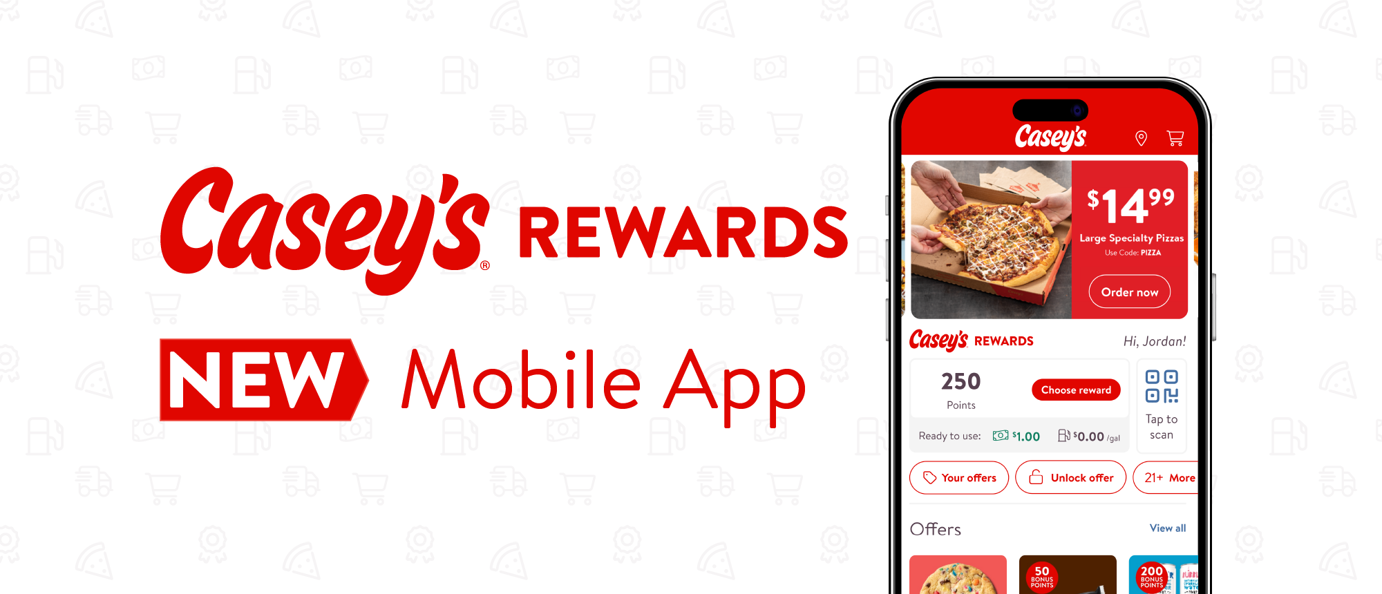
Casey’s is a convenience store chain primarily located in the Midwest. They are famous for their pizza but offer a variety of goods and services with a developing name brand. In 2020, they refreshed their branding and have been gradually updating their technology to reflect it, including an app and rewards program refresh.
My time at Casey’s as a UX Design intern was to create an email design system that could be used by the UX and marketing team to create stylized marketing emails. I would use the existing web design guidelines as a reference, but creating the components and documentation was entirely up to me.
The Problem
The marketing emails Casey’s used at the time were outdated. The refresh mentioned above was present but needed more work to inform the user they were reading a Casey’s email.
Creating emails was also difficult, as the designers who originally created the templates were no longer in charge, and they left little guidance on iterating. The UX and marketing teams struggled to use the existing codebase, resulting in less output.
Outdated brand identity.
Difficult to navigate code base.
Less control over email design.

Goals
#1
Update email visuals to reflect refreshed branding.
#2
Make creating new emails easier for marketing team.
#3
Create onboarding for new design system users.
Research
Competitive Analysis
I conducted a competitive analysis with Casey’s primary and secondary competitors and their use of marketing emails. The primary objective was to learn more about email design and how to do it in this space. I found several themes of email creation including the structure, visual design, and content rules that other companies used, and presented them to the marketing team so I could share what I learned.


Findings
Insight #1
There was a common layout in almost all of the emails analyzed. For mobile users, the single column layout was used to adapt to the slim screen sizes, and would become multi-column grids with more screen real estate.
Insight #2
The brand identity of the company was clearly present in the email, through visual design like color and typography.
Insight #3
Many common elements were present, such as a rewards bar indicating how close you were to another tier of reward, or a section dedicated to CTAs, prompting the user to act on the advertisment.
Insight #4
Many larger companies such as Dunkin or Starbucks coded the entire emails, rather than making a graphic for the email. This was to help accessibility tools such as text-to-speech process an email’s content.
Other Research
Usability Survey
A usability survey regarding the current state of Casey’s emails was created a sent out to app users. The data found was helpful, but only reinforced design decisions being made.
Litmus
Litmus is a website dedicated to all things email, and I read many articles regarding various topics such as HTML, Design Systems, and more.
N/Ng Paper
I read a report regarding the usability of emails conducted by a research at Nielson/Norman Group, and reported my findings to the UX team, hopefully to be used at a later date.
Designing
Mockups
The foundation for my design work was based on atomic design, where components are broken down into fundamental elements to support modularity and structure. I made wireframes and later mockups in Figma that captured that, where buttons, text, and many other elements could be replaced easily.
The visual designs were updated too, and made use of Casey’s branding of color and font. This was my first project where brand guidelines already existed, and it was insightful in how different the processes is from building from the ground-up.

Developing
From designs to code
I implemented my designs into code using Adobe Dreamweaver, and I learned a lot about the development of emails. The existence of several ESPs, like Outlook and Gmail meant that they don’t all interpret the same code the same way.
This created a challenge in implementing stable code across the different platforms. It was difficult to balance staying true to the original design and making compromises so the emails wouldn’t break for specific carriers.
Staying true to the atomic design framework, email modules were broken down into chunks, where elements such as CTAs or headings were divided. This structural choice made it far easier for those unfamiliar with the language to identify these key elements and drag-and-drop the pieces they needed at the time rather than working around an old template. This would surely boost the efficiency and learning curve of creating emails.

Documentation
Style Guides
Documentation regarding visual design and structure was created to ensure that onboarding new personnel would be less daunting in the future. When I had started at Casey’s, it was a little difficult to get started with all the design systems and guidelines, and that firsthand experience made me realize how important it was.
I also created a short onboarding tutorial for those who would need to use the design system and weren’t familiar with our tools, such as customer experience and marketing. I did research into creating design systems from the Config convention going on at the time and learned a lot about the process.


Results
Goal #1: Update Visual Branding
The visual design of Casey’s emails has been updated to better reflect the refreshed branding that is present in its other areas, such as Casey’s app and website. Many elements of the brand’s web guidelines, such as typography, color blocking, and spacing, have been brought over. This results in a cleaner visual presence for all marketing emails.
Goal #2: Making Emails Easier
When I first arrived at Casey’s, I was walked through the process of creating an email with their old process left by developers who were no longer with the company. It was confusing and slow, as little documentation had been provided to help users. Also, without an explicit understanding of HTML and CSS, changing things like content and visuals was difficult. The presence of a design system and documentation provided a “source of truth,” which can alleviate the difficulties.
Furthermore, the decision to use an atomic design framework allowed for modules that were distinct and interchangeable, meaning the process of creating an email using said modules was much easier and more intuitive than before. With proper instructions and guidance, the need to know frontend has been alleviated.
Goal #3: Onboarding for New Users
The documentation and onboarding tutorials left are a acceptable start to what I would assume to be a much larger operation in the future. While I may not directly hear the impact of my work, intial feedback after my final presenetation of the design system showed a better understanding of creating emails than before it was there. With time, I hope that the process will improve and the UX and marketing team and follow-up on my intial work to improve as it’s applied in the future.
What I’ve Learned
The opportunity to intern at Casey’s over the summer was amazing and I’m incredibly grateful for my time. For the first time in my UX career, I was put on a project with real consequences. Being given the privilege to run the email design system project was so insightful, and I learned so much:
Know your stakeholders. Working in a corporate environment meant that there would be several departments at a time interested in my work, as it would be used for future marketing. Learning how to prove my design with research and facts to get them onboard was incredibly useful and a skill I won’t take for granted.
Use your resources. Being surrounded by experts in UX gave me a vast amount of personal resources I hadn’t had access to before. Being able to utilize them to polish my work was instrumental in making as much progress as I did.
Document, Document, Document. Going from countless meetings with various projects and priorities was difficult to keep in my head. I began to leave myself a note at my desk at the end of every day telling me what was on the docket for the next day. Having a fresh source of truth to come back to every morning was vital in keeping track of all of my projects, including the design system.
Make mistakes. Perhaps the most important lesson learned during my time was to not be scared of mistakes. It was humbling to see so many experts in my field, so much so that I realized just how much further I have to go. I gave myself the grace to experiment and potentially fail, knowing I would learn something at the end. I messed up a lot, but I learned that shouldn’t bring down my drive to improve and become a better UXer.